


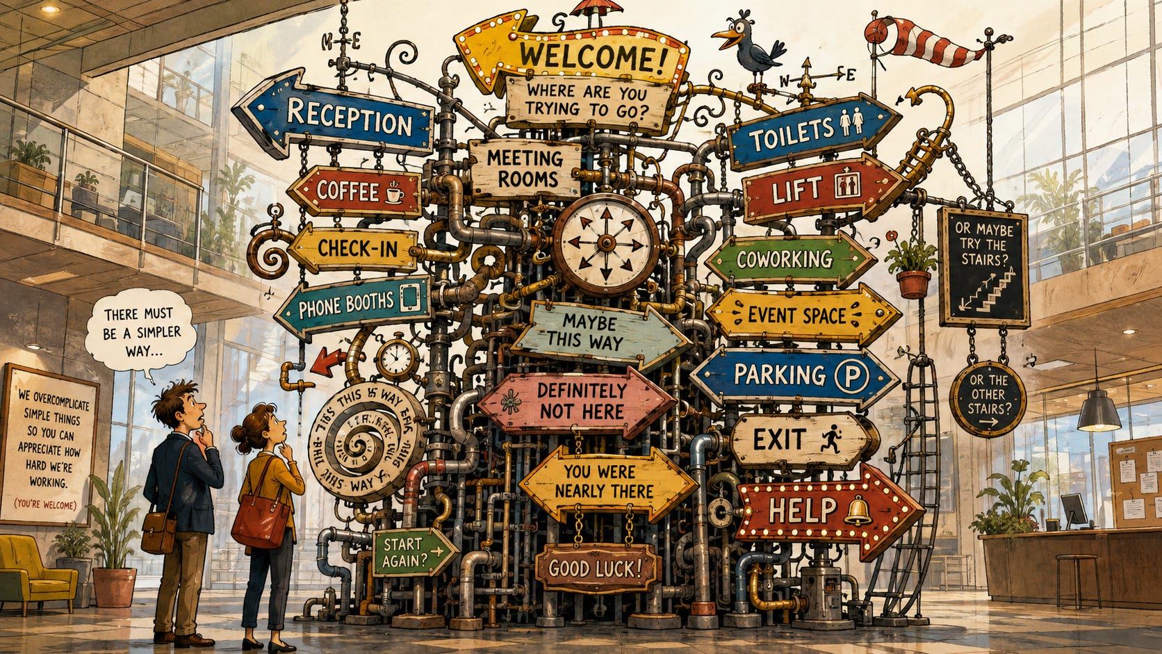
Businesses love metrics.
Revenue per square foot.
Conversion rate.
Average transaction value.
Labour percentage.
NPS.
CSAT.
Utilisation.
Retention.
All useful.
All sensible.
All capable of being discussed for forty-five minutes in a meeting while, downstairs, a customer is standing in front of a door they cannot work out how to open.
That’s the bit I’m interested in.
We’ve become incredibly good at measuring what happened and strangely bad at measuring what it actually felt like while it was happening. We know what people bought, how much they spent, whether they came back, whether they gave us an eight or a nine when we emailed them three hours later asking how likely they were to recommend us to a friend.
Very sophisticated.
What we don’t tend to know is how many times they got confused, hesitated, moved something, needed rescuing by a member of staff or quietly decided they couldn’t be arsed anymore.
Most KPIs are basically autopsies.
They tell you what already happened.
Revenue fell. Conversion dropped.
NPS moved three points. Retention softened.
Fantastic.
By the time the dashboard notices, the customer has already stood outside the wrong door, failed to connect to the Wi-Fi, asked where the toilet is, watched someone manually override the booking system and decided they’ll probably go somewhere else next time.
We’re very good at measuring the corpse. I want the vital signs.
So I’ve made some new KPIs.
The methodology is robust.
The benchmarks are internationally recognised.
I will not be taking questions.
1. Door Hesitation Index (DHI)
Definition: The average period of visible uncertainty experienced by a first-time visitor attempting to enter your business.
Formula: DHI = Total Entrance Hesitation Seconds ÷ First-Time Arrivals
Benchmark:
Time Rating Under 2 seconds Excellent 2 to 5 seconds Acceptable 5 to 8 seconds Concerning 8+ seconds You’ve built an escape room
You know the moment. They approach the door. Slow down. Look through the glass. Look at the handle. Look for a buzzer. Try one door, then another. Perform that strange little half-step humans make when they know there is a decent chance they are about to look like a dick. Eventually someone inside notices and waves them in.
Businesses spend fortunes designing arrival experiences. Architects discuss sightlines. Brand teams commission signage. Someone selects a lamp that costs more than my first car. Then Dave from procurement stands outside for eleven seconds wondering whether he’s supposed to push, pull, scan, ring, knock or simply believe hard enough.
That eleven seconds is your arrival experience. Not the mood board. Not the render. Not whatever somebody wrote under “sense of arrival” in the design brief.
The confused man at the door. Measure him.
2. Staff Pointing Frequency (SPF)
Definition: The number of times employees are required to physically indicate the location of something a customer should reasonably be able to find themselves.
Formula: SPF = Total Directional Finger Extensions ÷ 100 Customer Visits
Benchmark:
Range Rating 0 to 10 Intuitive environment 10 to 25 Mild dependency 25 to 50 Staff acting as supplementary signage 50+ Heathrow ground crew
“Where are the toilets?” Point. “Where do I collect this?” Point. “Which way are the meeting rooms?” Point. “Where do I check in?” Point.
A little pointing is obviously normal. But if your frontline team spend half the day looking like they’re marshalling a 737, perhaps you don’t have exceptionally helpful staff.
Perhaps your building is fucking confusing.
This is where businesses get themselves into trouble. We see someone compensating for a bad experience and call it great service. “They’re always so helpful.” Wonderful. Why does everyone need so much help?
If your people constantly have to explain the building, navigate the customer journey, decode the process and point people towards basic facilities, they are not adding hospitality. They are patching holes. There is a difference.
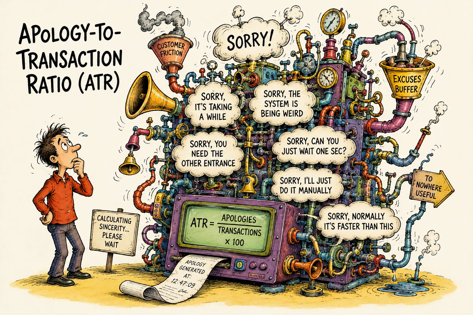
3. Apology-to-Transaction Ratio (ATR
)
Definition: The number of customer-facing apologies required to successfully complete ordinary business activity.
Formula: ATR = Customer-Facing Apologies ÷ Completed Transactions × 100
“Sorry, it’s taking a while.” “Sorry, the machine does that sometimes.” “Sorry, you need the other entrance.” “Sorry, the booking hasn’t come through.” “Sorry, I’ll just do it manually.” “Sorry, it’s normally quicker than this.”
The interesting thing is that every one of those transactions can still appear as a success. Payment taken. Booking completed. Customer served. Green tick. From a reporting perspective, everything worked beautifully. Meanwhile your staff are spending their day apologising for the machinery around them.
We should probably stop automatically interpreting that as warmth. There is a point at which hospitality stops being hospitality and becomes damage control delivered with eye contact.
Nice employees are incredibly effective at hiding bad businesses. They smooth over the rough edges, remember names, find workarounds, take the blame, make customers laugh, fix things they didn’t break. Then management looks at the customer score and thinks the operating model is working.
It might not be. You might just employ lovely people who are exhausted from protecting customers from it.
4. Chair Migration Coefficient (CMC)
Definition: The frequency with which customers physically relocate furniture away from its intended position.
Formula: CMC = Customer-Initiated Furniture Relocations ÷ Occupied Seating Sessions
Typical causes:
Proximity to plug socket
Avoidance of draught
Better natural light
Conversation distance
Escaping a chair selected primarily because it photographed well
I love this one because the customer gives us data and we physically put the data back where it came from. Customer moves chair. Customer leaves. Employee moves chair back. Next customer arrives, moves chair to exactly the same place. Employee moves it back. Repeat. Day after day, month after month, year after year, and somehow nobody concludes that perhaps the customers know where they want the fucking chair.
We worship design intent long after reality has voted against it. The architect decided that table belongs there. The customer keeps moving it here.
At some point this stops being untidiness. It becomes a referendum. And the architect lost.
If fifty people move the same chair, leave it there. Congratulations, you’ve completed your post-occupancy evaluation.
5. Human Override Rate (HOR)
Definition: The percentage of supposedly automated or self-service journeys requiring intervention from an employee in order to reach completion.
Formula: HOR = Manually Rescued Journeys ÷ Total Automated Journeys × 100
QR code won’t load. “I’ll sort it.” Digital pass hasn’t activated. “I’ll let you through.” Booking confirmation hasn’t arrived. “Give me your name.” App logged them out. “It’s easier if I just do it for you.”
The transaction completes. The system records success. Someone later presents a slide announcing that 94% of customers successfully used the new digital journey.
No they didn’t. Michelle used the digital journey. Fourteen customers used Michelle.
This happens everywhere. We introduce technology to reduce friction, then employ humans to absorb the friction created by the technology, then use the successful transaction data to prove the technology reduced friction.
Beautiful.
If your self-service journey requires a member of staff standing beside it explaining how to self-serve, you haven’t automated anything. You’ve built a more expensive queue. And if your software only works because Sophie stands next to it all day, Sophie is the software. Put that in the transformation deck.
6. The Fuck-It Rate (FIR)
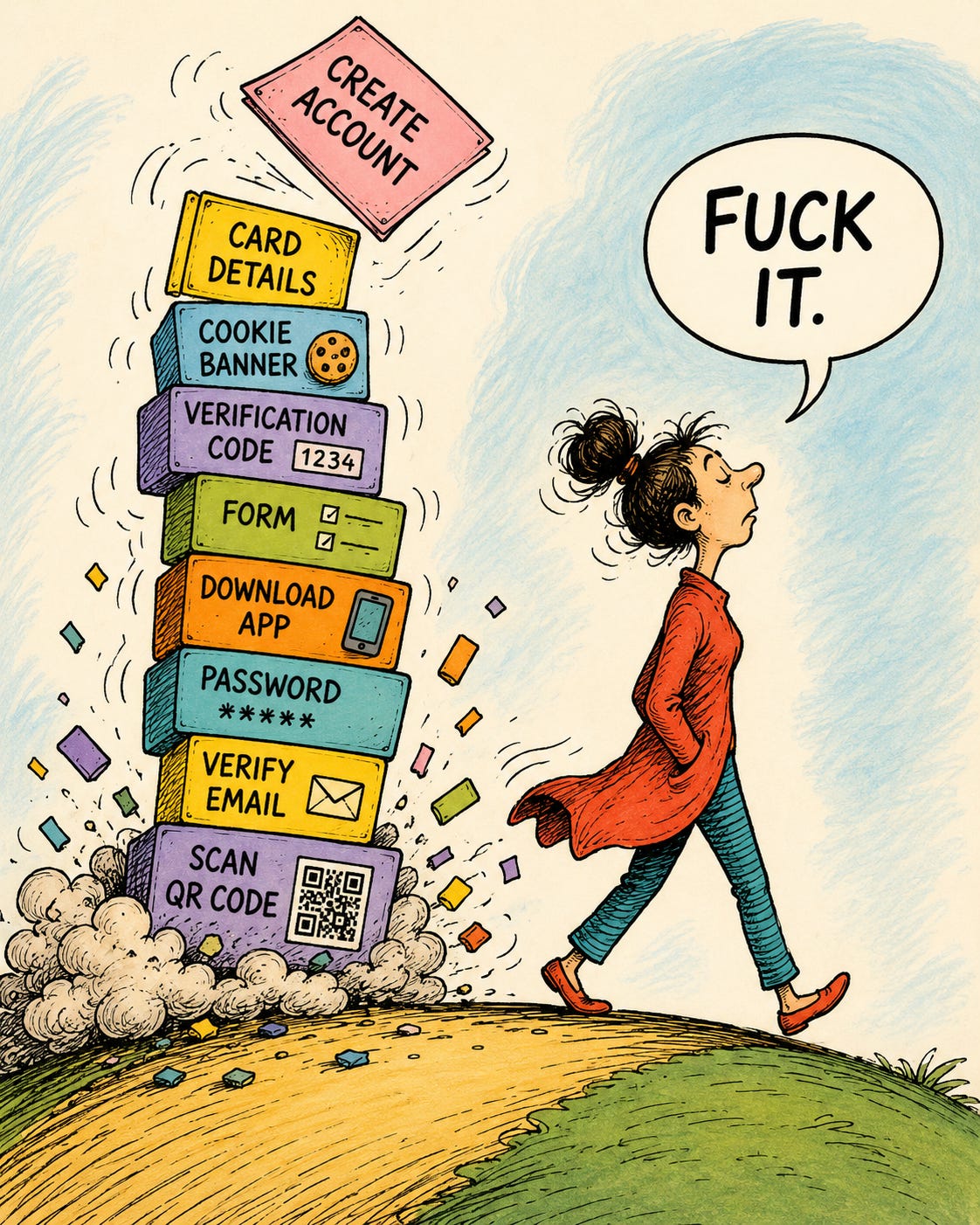
Definition: The proportion of identifiable customer intentions abandoned when the effort required to complete an action exceeds the perceived reward.
Formula: FIR = Friction-Induced Abandonments ÷ Observable Customer Intentions × 100
This is the metric I actually want.
Customer wants another drink. Scan QR code. Page loads. Create account. Enter email. Confirm email. Create password. Add card.
Fuck it.
Customer wants to park. Download app.
Fuck it.
Customer wants to change a booking. Chatbot appears.
Fuck it.
Customer wants to buy something. Website says “Get in touch to learn more.”
Fuck it.
Customer wants to pay you money. You have somehow made that their administrative problem.
Fuck it.
These customers are fantastic for your KPIs. They don’t complain, don’t raise a ticket, don’t ask for the manager, don’t write the angry email, don’t damage your NPS. They simply leave. Quietly. Politely. With their money.
Most businesses obsess over the customers who convert and the customers who complain. I’m more interested in the enormous group in the middle who wanted something, encountered one unnecessary piece of bullshit and decided life was too short. You probably don’t know who they are. That’s precisely the problem.
7. Workaround Proliferation Score (WPS)
Definition: The concentration of unofficial employee-created solutions required to make official processes function in the real world.
Formula: WPS = Active Unofficial Workarounds ÷ Official Operating Processes
Recognised workaround categories include:
The spreadsheet everybody uses but nobody mentions
The WhatsApp group doing the job the expensive platform was supposed to do
The handwritten sign
The bit of tape showing where something belongs
The door permanently wedged open
The unofficial shortcut everyone knows
The laminated instruction reading: PRESS GREEN BUTTON TWICE
Every workaround is evidence. At some point, the official version of reality met the actual version. The actual version won.
Businesses tend to hate workarounds because they look messy, inconsistent, uncontrolled, unapproved. Someone from head office walks in, notices the handwritten sign and says: “Can we take that down? It doesn’t look very professional.”
Maybe. But before you take it down, ask why it exists. Sarah did not wake up on Tuesday morning with a lifelong ambition to laminate an unauthorised instruction. Sarah got asked the same question thirty times. Sarah found a solution. Sarah has probably understood the failure more clearly than the person who owns the process.
There is something deeply funny about a business spending £80,000 on a system, £20,000 implementing it, three months training people on it and another £10,000 producing reporting from it, while the operation is actually being held together by Sarah, masking tape and an Excel file called FINAL_v7_USE_THIS_ONE.xlsx.
That’s not an exception. That’s your operating model.
None of these KPIs are real. Yet.
But I’d argue they capture something most of the real ones don’t.
Your normal KPI pack tells you what survived the journey: the customer who successfully entered, the transaction that completed, the booking that made it through, the complaint that was submitted, the customer who stayed long enough to be surveyed. It’s survivor bias with conditional formatting.
Everything that happened before those outcomes barely exists. The person who hesitated. The person who had to ask. The person who moved the chair. The staff member who quietly fixed the system again. The customer who thought about spending £20 and decided it wasn’t worth creating another fucking account. The employee who built their own spreadsheet because your official process was making everybody’s life harder.
Those behaviours aren’t noise around the customer experience. They are the customer experience.
And that’s the uncomfortable bit. We’ve spent years convincing ourselves that more data means more understanding. It doesn’t. You can know precisely how many people entered a building yesterday and have absolutely no idea what it was like to enter it. You can know your conversion rate to two decimal places and still have no clue how many people tried to buy and gave up. You can have an NPS of 72 while your best employees quietly perform operational CPR all day. You can produce a beautiful dashboard proving the business is working while somebody downstairs has stuck a Post-it note over the official instructions because the official instructions are wrong.
Dashboards are useful. But they’re also comforting. They turn messy human behaviour into numbers we can control, into a meeting, a target, a RAG status, an action someone can own. Nobody has to stand downstairs for an hour and watch actual people struggle with the thing we built.
Which might be the metric we’re missing most: how often do the people making decisions actually watch customers use the business? No survey. No dashboard. No report. Just stand there. Watch the door. Watch where people hesitate. Listen for the apologies. Notice what they move. Count how often your “seamless” system gets rescued. Find the handwritten signs. Ask what the weird spreadsheet does. Follow the customer who mutters “fuck it” and leaves.
Because the data is already there.
It just isn’t in Power BI.
And frankly, if your KPI pack says everything is green while Sarah is holding the place together with masking tape and a laminated sign, your KPIs are shit.
👏